UX writing and content design
Here are some examples of projects I’ve worked on with design squads to create or improve user journeys. They include a website redesign, improvements to online buying guides, creating information hubs, and more. I’m happy working with Figma, Miro, Jira and Confluence as well as a trusty stack of post-its.
Redesigning the Barclays Intermediaries website
The challenge
The website for mortgage brokers had been maintained with minimal updates for several years. Brokers fed back that it was a poor experience and it ranked low on user satisfaction. Our goal was to redesign the site with a clear purpose to meet the needs of the brokers.
What we did
Squad workshops to gather themes from research and conduct competitor analysis
Card sorting exercise to group content, flatten hierarchy and make it easier to find content
Collaborated closely with designer and business SME to build out pages with the right content
Gathered feedback through rounds of user testing, stakeholder crits and peer reviews
Reviewed copy and amended to plain English and Barclays tone of voice
Redesigned homepage with clear identity and surfaced most-needed content
Recategorised dense lending criteria information to make it easier to navigate
Presented all mortgage deals in one place, reducing clicks
Added timestamps to show how recently the updates were made to give the users confidence that information was up to date
Reviewed terminology e.g. calculators are one of the most popular features, but they were buried in the ‘Tools’ section, so we renamed the section to ‘Calculators’
Created new sections for latest news and podcasts to give the users more reasons to return


Redesigning the John Lewis buying guides
The challenge
The online buying guides were the highest converting pieces of content on the website and aimed to reflect the impartial product expertise that you would find from an employee in a John Lewis shop. The guides were created over a number of years, were inconsistent, and there was a big opportunity to optimise them. We were briefed to rewrite and redesign all 70 of them.
What we did
Worked with UX researchers and designers to prototype and test a template structure for the guides
Customer testing allowed us to watch customers talk through their experience of using the guides, allowing us to iterate based on their feedback
Applied a best practice approach that focused on feature benefits and how to solve customer’s problems
Led a team of contractors to edit and rewrite the guides based on the insight


Tailoring John Lewis Personal Style Edit tool
The challenge
A high return rate on fashion items and its effect on profitability prompted the need for better sizing information and guidance for customers. I was invited to a 2-day war room with stakeholders from across the business to scope out solutions and prototypes for an online tool to improve the issue. The output shaped our requirements for a collaboration with Dressippi to tailor their sizing tool for John Lewis.
What we did
Collaborated with the Product team and Dressippi to edit each stage of the survey journey and ensure copy was in the John Lewis TOV
Collaborated with UX researchers and designers to adapt the journey based on customer feedback
Managed the editing process of hundreds of copy variants for the personalised survey recommendations
Worked with the Marketing team to develop the campaign and launch the tool to customers


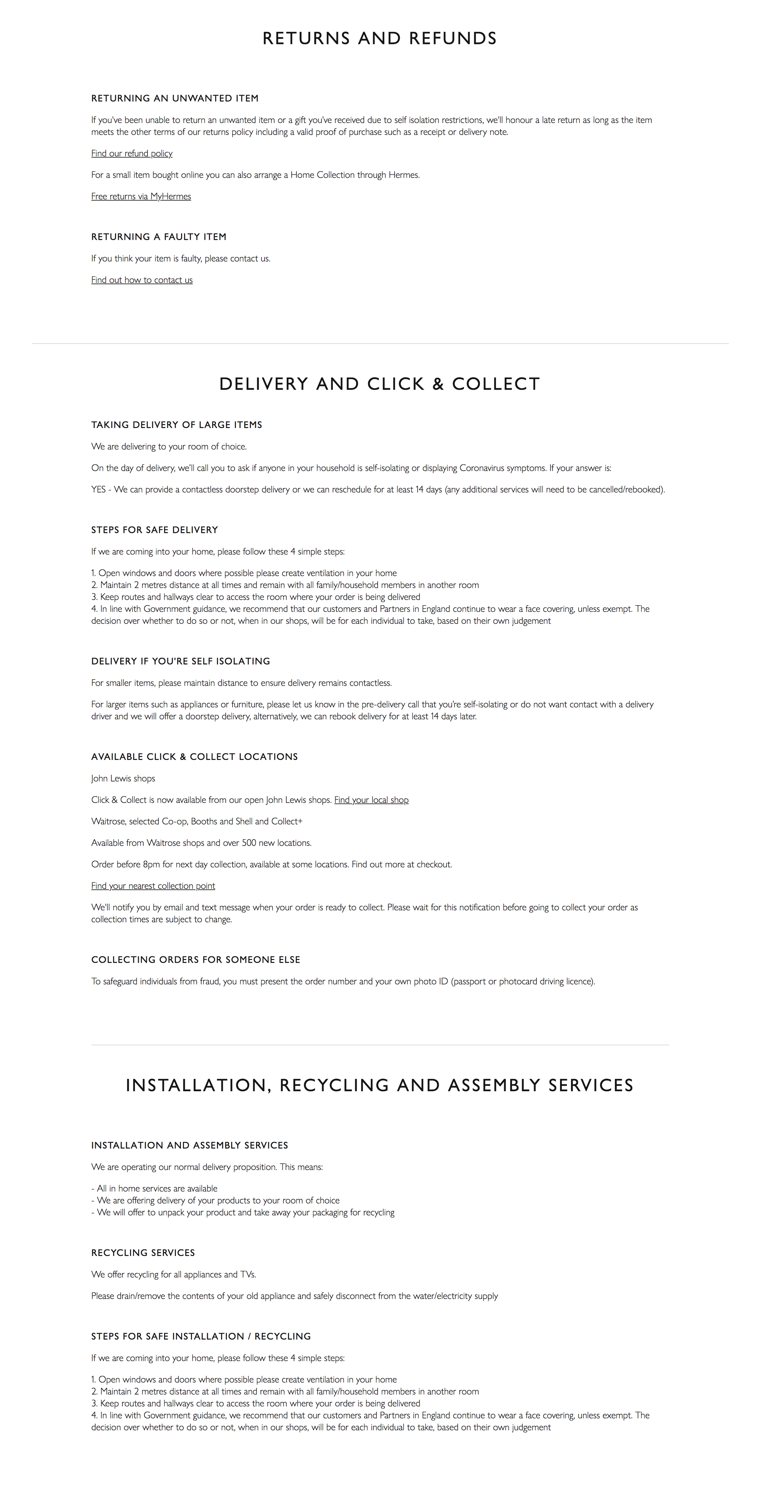
Creating John Lewis covid communication hub
The challenge
The first lockdown obviously had a huge impact on John Lewis shops, services and online fulfillment, so we were tasked with making all the essential information easily available and understandable for our customers. Our brief was to create a single destination to house all information and updates, where customers could be directed to.
What we did
Collaborated with Marketing team to gather the relevant information on closures, impact to services, safety protocols and more
Worked with UX designers to scope the page at pace and make it as simple and easy to digest as possible
Joined daily calls throughout the pandemic to update the content with requirements coming from all over the business
Scrutinised every new request, edited the information to ensure the copy was consistent, and kept a thorough log of all amends
On the back of user testing, content was continually reordered and reorganised, with dedicated pages for England, Scotland and Wales created to reflect the differing restrictions in each home nation

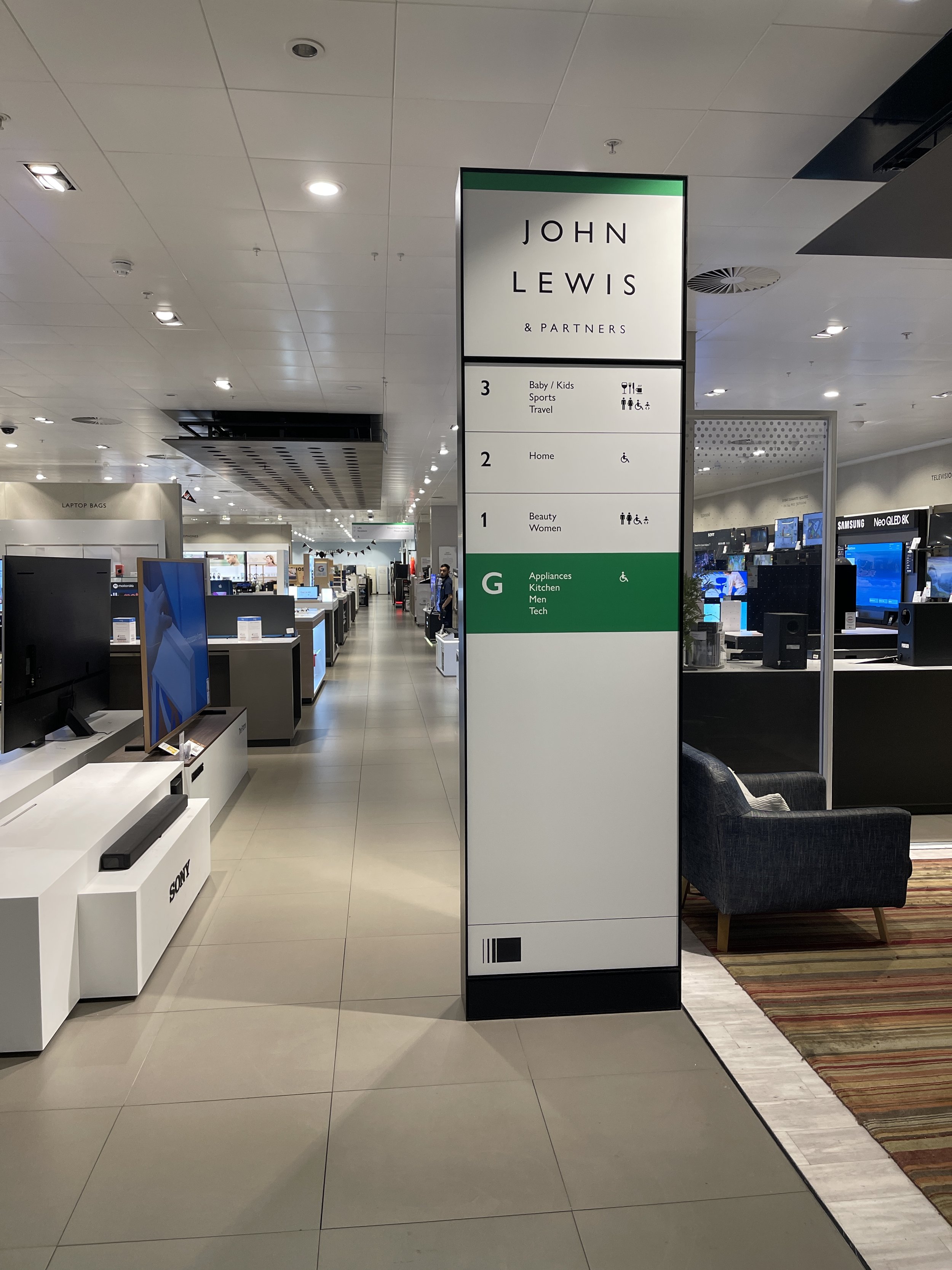
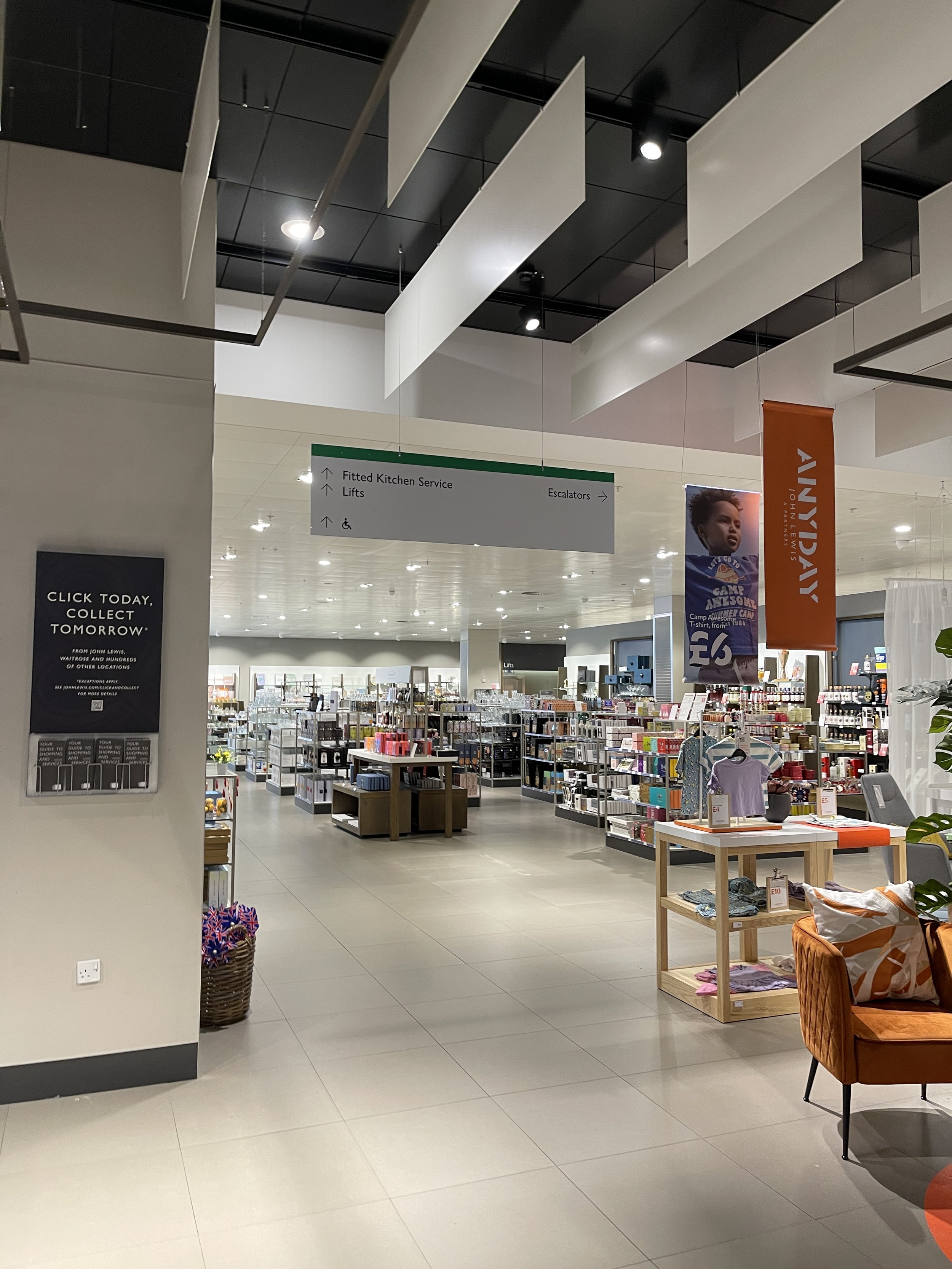
Improving John Lewis in-store wayfinding
The challenge
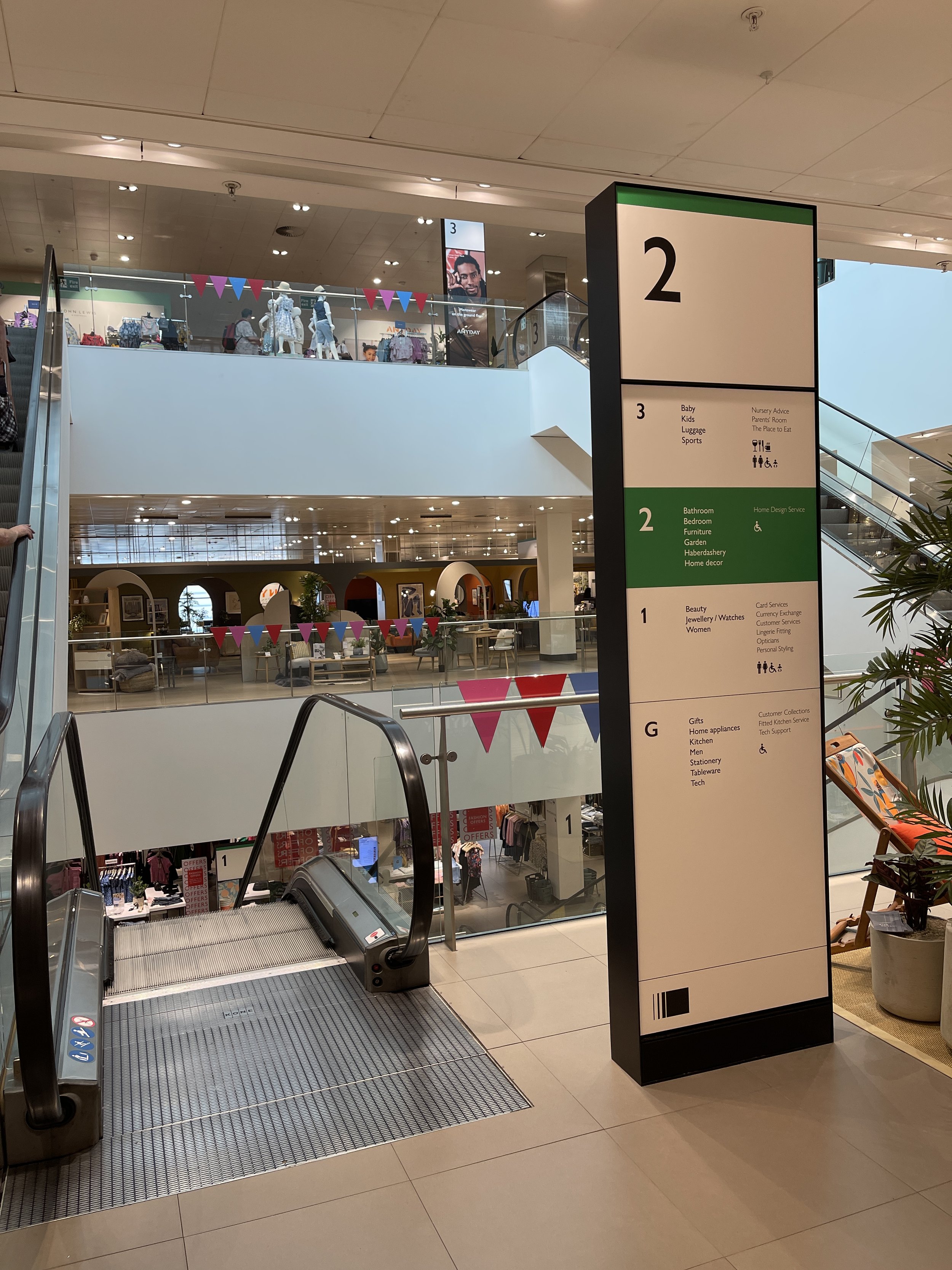
The feedback from customers and employees in store was that there was too much information on wayfinding formats around the shops, and that the terminology was old fashioned and out-of-date. Our brief was to come up with a new approach that would help customers find where they needed to go and also reflect a modern brand.
What we did
Collaborated with the Store Design team to review existing formats and consider the customer research
Reviewed all existing store terminology and aligned to online SEO-rich language, and consolidated departments using broader terms
Introduced new formats for different parts of the journey e.g. concise versions at entrances, further detail at escalators, and brand wayfinding in departments to reflect customer behaviour
Produced a new comprehensive terminology guide for artworkers
After a successful test in the Stratford shop, the approach was approved for rollout across the estate

Creating John Lewis virtual services journeys
The challenge
As John Lewis shops closed in March 2020 due to Covid, access to expert Partner services was no longer available in store. Service is a key differentiator for John Lewis so it was important to replicate and offer that expert advice online. Our brief was to develop and market online ‘virtual services’ for home design, personal styling and nursery advice.
What we did
Collaborated with Marketing team to reposition each service and refresh boilerplate copy
Collaborated with UX designers to wireframe and design pages for each service
Reviewed booking journey to adapt to an online appointment (and subsequently to choose between in-store and online)
Researched and produced online profiles for expert Partners
Marketing copy for services via email newsletters, online banners, social and windows
As shops reopened, virtual services remained popular and offer a convenient alternative for customers


Creating ‘Anyday’ omni-channel journey
The challenge
John Lewis launched the own brand Anyday in summer 2021. Showcase areas were built in shops to introduce the range and show how broad the assortment was. Although the launch was successful, there was consistent feedback that customers didn’t know that a much wider range was available throughout the shop and online. Our task was to solve this problem.
What we did
Worked with the UX team to review the customer feedback and verbatims and re-map the customer journey
Developed copy to introduce the brand at entrances and drive footfall to showcase area
Produced copy for the showcase areas at product level that guided customers to a specific department to find a wider assortment and online to the brand store via a QR code
Produced directories that showed a clear, comprehensive list of what categories were available across the shop
Developed messaging for branded hotspots in the relevant departments to drive people online for newness and further sizing options
Applied similar thinking online with ‘disrupter blocks’ added to product listing pages that directed customers to the full brand assortment


Writing John Lewis store closure communication
The challenge
During the pandemic, John Lewis sadly had to close 16 shops. Managing the announcement and communication of the news to employees and customers needed to be sensitive. Working under NDA, I was briefed to develop messaging that addressed the sensitivity, provided all the relevant information, and showed how customers in the area could continue their relationship with John Lewis.
What we did
Developed high level messaging that paid tribute to employees and customers
Collated all the relevant information that needed to be communicated on the process of closure and how the company would support those being made redundant
Balanced feedback from a variety of stakeholders including UX, Legal, PR, Marketing, HR and Creative, to keep it readable and accessible
Collaborated with UX to gather, consolidate and edit information into FAQs that would answer the concerns of customers


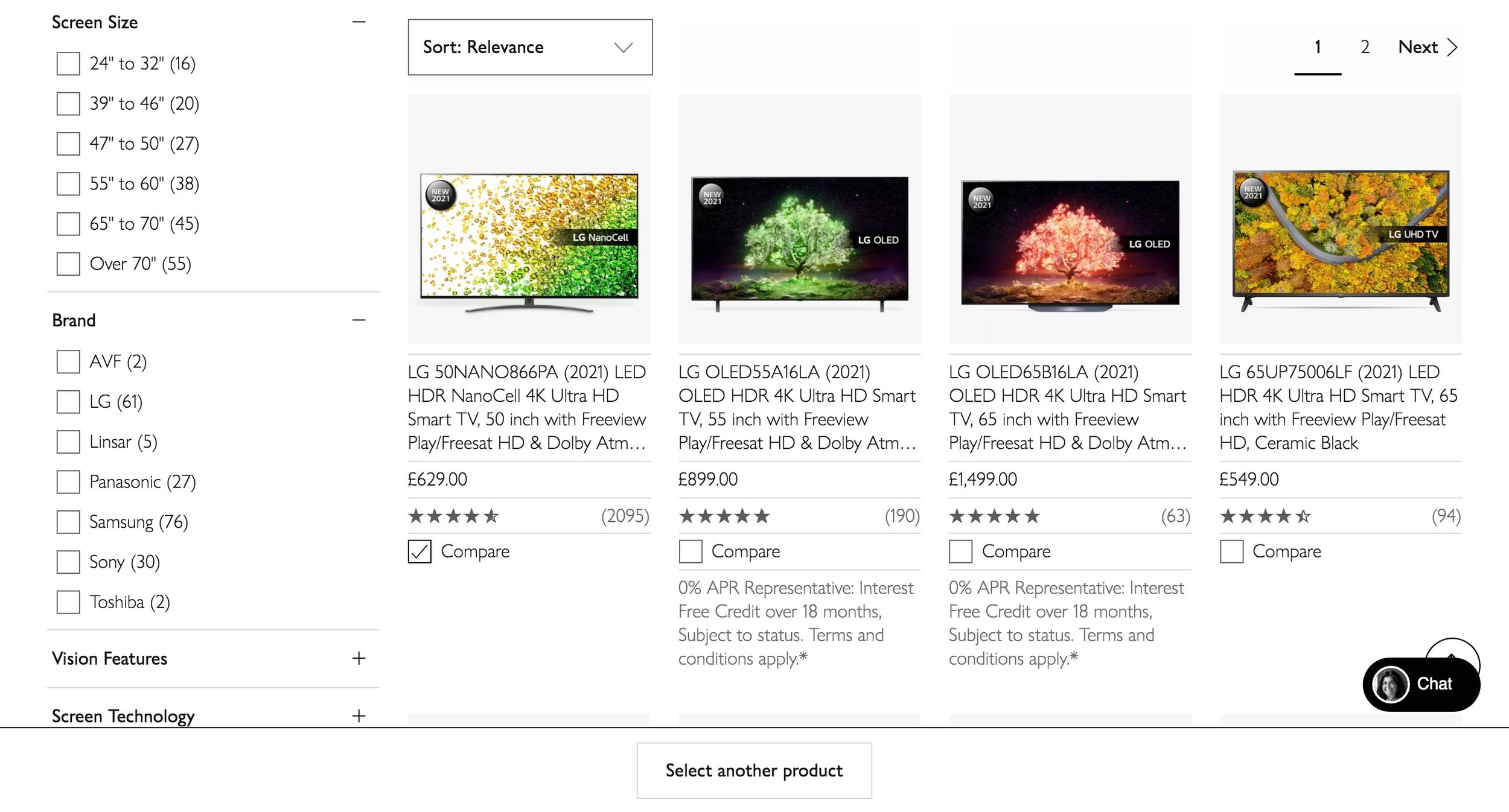
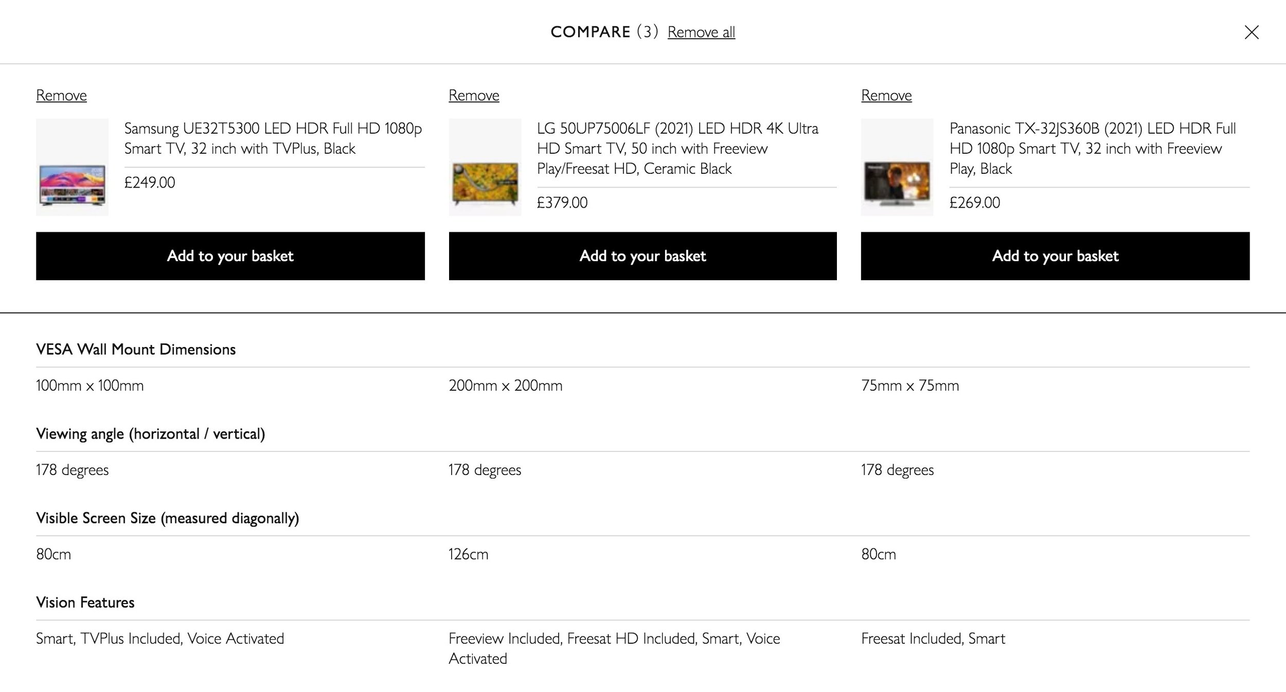
Setting up John Lewis comparison table functionality
The challenge
This project required me to research, standardise and implement a full list of product attributes and values for each TV product page. This consistency of information would then allow comparison table functionality to be applied to the category so that a customer could compare the product information of up to 4 TVs with consistent information in columns side by side.
What we did
Through competitor and customer research I devised a list of attributes to be applied to each product
Produced a style guide for fellow writers on how to fill in attributes, later replaced by fixed value drop downs and limited free text
Negotiated with Buying team to ensure the attribute information would be provided by brands for each product going forward to ensure consistency
Routinely tested the performance of attributes which helped to choose which ones to use for navigation
Following a successful rollout, the functionality was applied to most electrical product types on the website
